Overview
Transport Torture was created for Mercy For Animals to allow Canadian citizens to lobby their government and message local media outlets. The landing page provided a large video hero as well as details about the issue that needs attention. Selecting a large “Take Action” button directed the user to a page to enter their contact info as well as their postal code. An API was used to populate the contact info for the user’s actual government representative. They were also presented with a list of media outlets to send emails to as “letters to the editor”. Each contact option had multiple “letters” to choose from that auto populated the user’s contact info. The user could also edit the letter using the tine mce editor.
Google Analytics was used to track user interaction with the site as well the number of letter sent, the number of letters opened, and which official opened each letter. The campaign was highly successful and exceeded the expectations of the Canadian team as well as organization upper management.
- Main Responsibilities: Lead project design and functionality, data collection, user interacting/tracking
- Technologies used: HTML5, CSS3, jQuery, Javascript, Handlebars, WordPress
- Notable features:
- Responsive design
- Large video hero
- Large “Take Action” button
- Tabbed info area
- Image Slider
- User centered government contacts
- Developed for Internet Explorer 9+ as well as modern browsers
Header Video
Up to this point all of Mercy For Animals site that had the same goal used an autoplay YouTube video. We felt that turned people off and/or kept them from watching the videos. Instead we opted to have a black and white looping video playing with no audio play (not shown for graphic content). When the user selects to watch the video they were more likely to be engaged with the focus of the site.
Big Button
We felt the user needed a quick way to help the animals when they had read enough of the “why”. Simply having the header follow user didn’t add any urgency given its subtlety. Instead, we opted for a large “button” that slide down after the video area. Once the user read the content and saw pictures, there would be no question how to help. Upper management was worried it would turn people off but we found people were quick to select the button once they started reading content.
Triple Slider
With any campaign imagery is a massive part of grabbing the user. We provided multiple images to the user showing three at a time to ensure they got the full impact of the issue the site was attempting to address.
Form Overlay
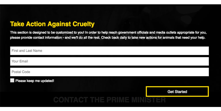
When the user accesses the take action page they are presented with an overlay that asks for contact information and their postal code. The user could also check a box to request future updates. The overlay fades out after submission to display the generated page content.
Email Sender
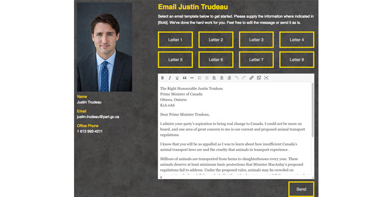
Once the overlay is submitted the site connected to an API that filled in the user’s local representatives with their photo and additional contact information. The user could also use select local media outlets and send their concerns pushing for media coverage. Each area had multiple letter options that populated with the user’s name and contact info. An editor was loaded with the letters content to allow the user to customize the letter if they wished. A single Google Analytics code was generated for each email sent to track when the receiver opened the email.